Villa Romana, a prototype packaging system by three School of Graphic Design students, is a “Concept We Wish Was Real” on TheDieLine.com. Robin Boström (BFA, 2014), Therese Ottem (BFA, 2014) and Itay Kapitulnik (graduating with a BFA in 2015) collaborated on the project for ithe school’s Package Design 4 class—a worthy addition to their graphic design portfolio, for sure—and it wasn’t long before the work began capturing a wider audience all on its own.
What is fascinating about the approach this team took is the way some of the conventional packaging tropes for Italian food have been integrated into an inarguably contemporary overall look.
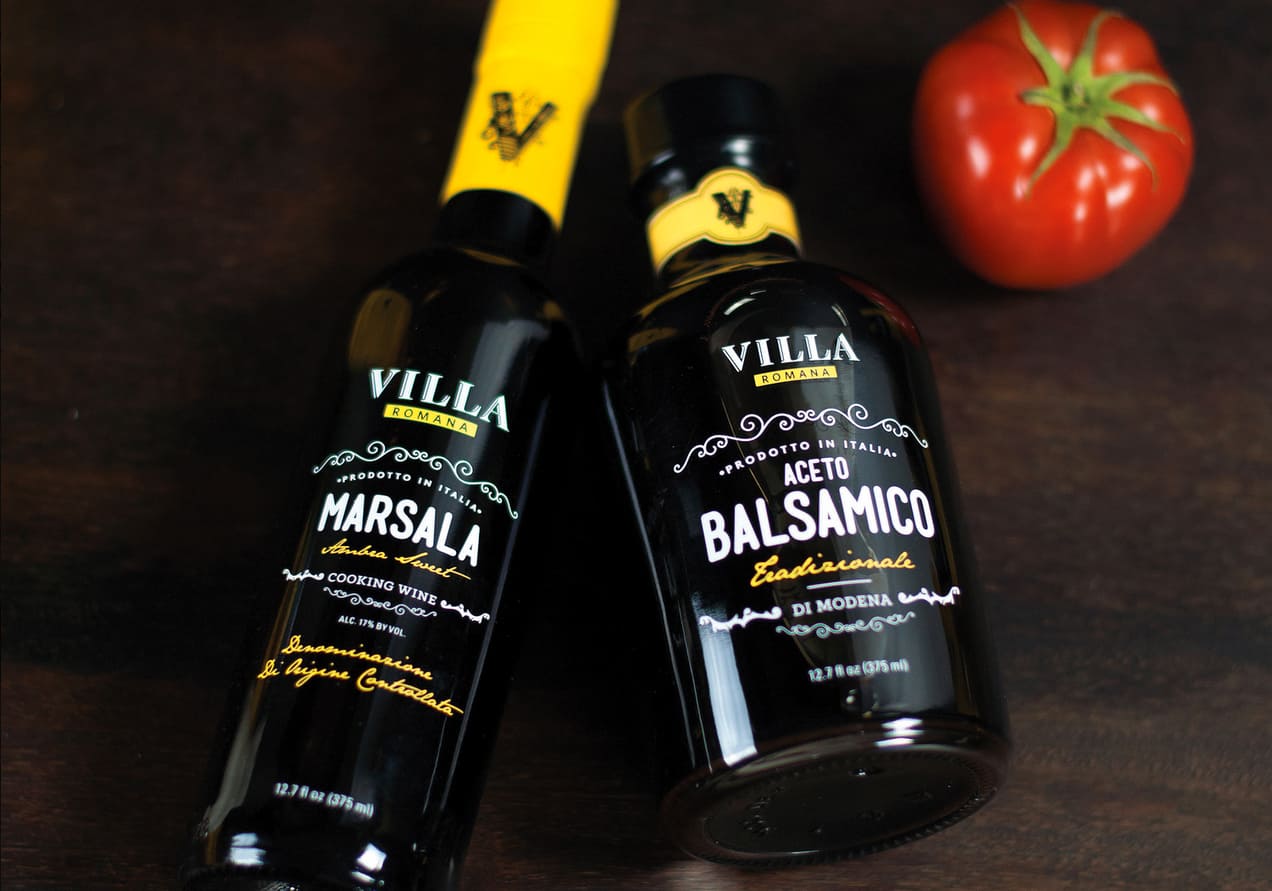
A closer look at the windowing on the products reveals a vignette border that is baroque by way of 2015; it’s almost typographical in its stylization. The contrast between pared-down materials and compositional sophistication is effective in signaling that something traditional is being made new again…very appropriate for these Italian standbys.
“Villa Romana is an Italian pantry brand that carries all the classic Italian pantry essentials,” say the designers. “Inspired by Italian racing cars, the line is consistently bright yellow with the exception of a few products in craft paper and glass. The style is a modern version of the Italian countryside.”
The particular hue of yellow chosen can’t help but evoke an Italian supercar (not the one with the prancing horse), completed by a solid black racing stripe. There is a “wedge”-ness and efficiency in form to the collection that is “aerodynamic” in a design sense.
Special recognition is due to course instructor Michael Osborne, who guided the trio to an up-to-date take on Italian culinary identity that sits solidly on a foundation of design fundamentals.


